Color has an undeniable impact on our emotions, moods, and overall wellbeing. In the world of interior design, understanding color psychology is a powerful tool that can be harnessed to create harmonious and engaging spaces. In this article, we delve into why color plays a crucial role, not just in interior design but also in our sense of wellbeing and mental health.
What is Color Psychology?
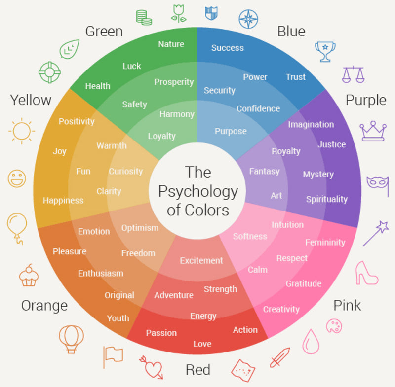
Color psychology is the study of how colours influence our behaviour and emotions. The subject has interested humans for a long time! Different colors evoke distinct psychological and physiological responses, ranging from calming and soothing effects to energising and stimulating sensations. Interior designers use this knowledge to incorporate colours into different spaces, to enhance what those spaces will be used for.
If you dream of a bedroom that helps you to wind down at night, for example, an interior designer would choose a muted, calming palette in skin tones and neutrals. The colours would promote restful sleep and a safe, cocooning sensation for deep rest.
Unleashing the Palette: Understanding Color Dynamics
Colors have the remarkable ability to shape our perception of space and evoke a range of feelings. With Deborah L Kerbel’s products as the canvas, let's embark on a journey of audacious color pairings that amplify the allure of these exquisite furnishings.
Regal Opulence: Amethyst Elegance
Pairing the regal allure of amethyst with Shop Deborah L Kerbel's opulent furniture pieces creates an ambiance of unparalleled elegance. Deep purples and rich gold accents lend a sense of luxury and sophistication, with each piece radiating a sense of timelessness. This combination evokes a sense of grandeur and indulgence, inviting occupants to revel in the lap of luxury.

Oceanic Tranquility: Aquamarine Serenity
Invite the soothing embrace of aquamarine into your design, complementing the calming essence of Shop Deborah L Kerbel’s furnishings. The gentle blues and greens evoke the tranquility of ocean waves, fostering an atmosphere of serenity and relaxation. This combination transforms spaces into sanctuaries of repose, where the stresses of the world melt away.

Enchanted Forest: Emerald Allure
For a touch of enchantment, consider pairing deep emerald greens with the intricate designs of Shop Deborah L Kerbel. This combination creates an atmosphere reminiscent of a mystical forest, where elegance and artistry intertwine. The lush greens add a sense of vitality, while our pieces infuse the space with an air of refinement, resulting in a design that is both captivating and harmonious.

Timeless Monochrome: Ebony and Ivory
For an enduringly elegant look, opt for a monochromatic palette of ebony and ivory. The classic combination of black and white provides a timeless backdrop that accentuates the intricate details of our furniture. This pairing emphasizes contrast and balance, resulting in a design that is both refined and visually striking.

Sunset Radiance: Coral Warmth
Harness the warmth and vibrancy of a sunset with a combination of coral tones and our furnishings. The warm oranges and pinks evoke feelings of joy and positivity, creating a space that exudes energy and vitality. Shop
Deborah L Kerbel pieces, with their unique designs, provide a complementary contrast, adding layers of sophistication to the vibrant color palette.

Creating Bold Combinations: Guiding Principles
While the examples above offer enticing color pairings, crafting your own bold combinations requires a nuanced approach. Here are some guiding principles to consider:
Contrast and Harmony: Strike a balance between contrasting colors to create visual interest, while ensuring they harmonize to maintain a cohesive and pleasing aesthetic.
Mood and Atmosphere: Choose colors that align with the desired mood of the space. Cool tones evoke calmness, while warm tones radiate energy and vibrancy.
Furniture as Focal Points: Let our pieces take center stage. Use colors that enhance and complement the unique designs, allowing the furniture to shine.
Texture and Material: Consider the texture and material of our beautiful pieces. Pair colors that enhance the tactile experience, creating a multi-dimensional design.
Personal Expression: Infuse your client's personality into the color choices. Reflect their preferences and culture, ensuring the design resonates with their individuality.


0 comments